Case Study
Logo Animations
What is a logo to you? Our clients use them at the start of videos, on their website home pages or as a traction enabler across social media — in this respect, logos are wonderfully versatile.
A static logo with solid design values will certainly enhance your brand’s identity, however, the average consumer needs several interactions with a static logo to gain familiarity. This is where animation excels as it reveals your brand’s personality but does so with lasting impact.
1.
Incorporating your logo and brand colours into animation can produce simple and defined results and tell customers more about you. The streamlined and unfussy aesthetic of this ultimate.ai sting, illustrates a friendly new tech company with a highly professional approach to their product offerings.
2.
A logo or animated title can also feed into your narrative and be tailored to the style of storytelling content that you are producing. The visual tone of this Talkies intro, for Talking Pictures TV, reflects their series of programmes in which they interview actors from a past era — as the illuminated design of the title suggests.
3.
Animation adds depth and insight into the functionality of your company, as shown by the Gespanntouren logo. The German company operates motorcycle tours for those fascinated by biking with sidecars, and the horizon, which grows in prominence, displays this effortlessly. The logo is now a staple for Tobias at the start of all his online videos.
4.
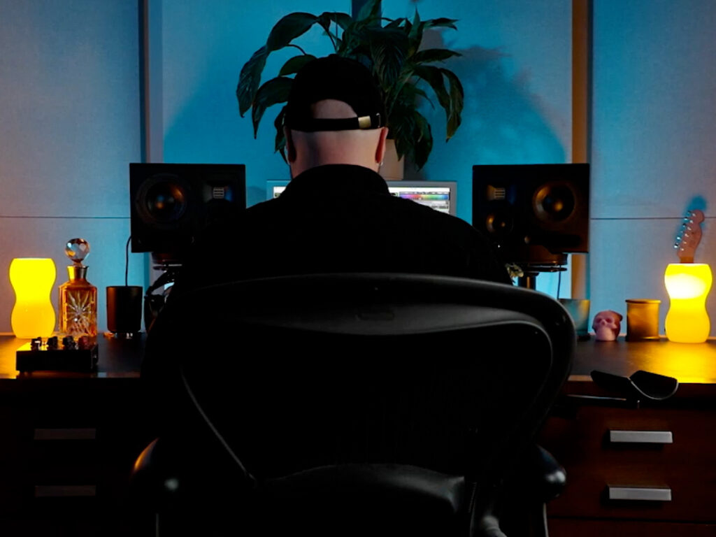
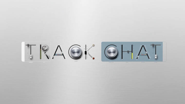
This intro animation was made for a music series as one of many ideas of potential Sony Music programmes. With just the name and subject matter outline as a start, we incorporated elements of studio equipment to create a themic and agile visual.
5.
Function & Form, our trusted partner who design and build bespoke websites, (such as ours), needed a clean reveal of their name — and here, less is definitely more. Through the addition of subtle movement engrained into your website logo, you can catch the attention of your audience for more vital seconds.
6.
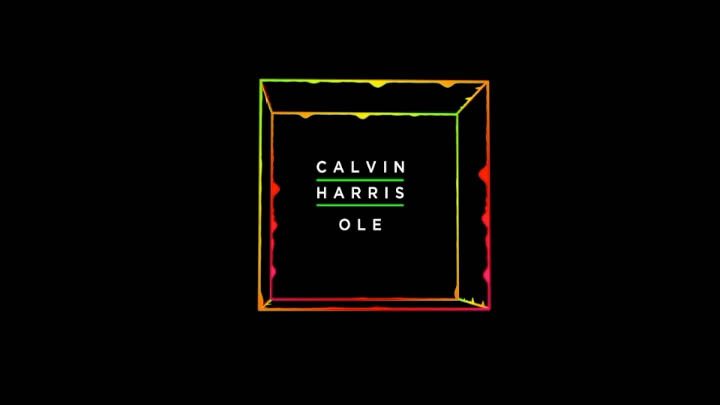
Animations can go further than merely being used on websites or videos. This continuous visualiser was made as a screen accompaniment for when Calvin Harris’ music was played — and we even built the visualiser to react to the beat of his music.
7.
We appreciate that logos often need to be multi-purposed; a logo on your website may require a reversed palette, to say, that of one found at the start of a video. We can deliver different versions of the same logo, to work in multiple situations while maintaining your identity.
8.
Who doesn’t love a logo that pops? We can give yours added realism by harnessing the power of three-dimensional. With such techniques, the character of your brand will capture both the eyeline and imagination of your customer.
Your logo reflects you, so why not have some fun? By adding sound effects and music we can further enrich your brand to attract only positive attention. Loftworks can even help to create a series of styles that could be themed to a variety of campaigns.

